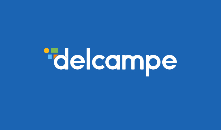
Behind Delcampe's new logo, there is a lot of teamwork and in particular the work of one person, Sarah Hulsmans. Sarah joined the Delcampe team five years ago. This discreet and efficient young woman is in charge of the graphic design of your favourite marketplace.

 Hi Sarah, how did you come up with the idea for this logo?
This new logo was born out of a necessity: the need for Delcampe to keep its identity while modernizing it.
We had a very free set of specifications so as not to restrict our creativity.
While keeping in mind the need for an identity, we shared a lot of ideas within our team.
Several themes emerged but we chose the most ambitious: collecting.
Symbolizing collecting without focusing on a specific collection was not an easy task. Many meetings were held in order to be able to present this new logo to you.
We decided to use the typography of the previous logo to keep a graphic coherence and not to destabilize our members. We gave it a slight rework to give it a more user-friendly and modern look while remaining easy to read.
To this typography, we have added graphic elements that symbolize the collection world. The abstract side makes it possible to imagine one’s collection. We can see a stamp, a postcard, a coin, a bill, a vinyl, a jewel and many other things.
The colours help to arouse the imagination of our members but also to recover the friendly aspect that was very important to us.
What did you like and what are you proud of in this project?
I really enjoyed the sharing of ideas and the challenge of this project.
We are proud to have created a logo that, in its abstract form, allows us to symbolize the world of collecting as a whole.
Besides the logo, what are the other projects you are involved in at Delcampe?strong>
All projects that require:
- a user experience review
- the design of one or more interfaces (e.g. the new item page)
- icon-making
- the making of illustrations
- the design of the Delcampe Award presented to MonacoPhil
Name three things you like about your job.
- Researching and sharing ideas.
- Enhancing the user experience for members based on their needs.
- New challenges every year.
Discover this brand new logo on Delcampe!


Very nice, but a looks a teeny-tiny bit like Windows – but then most of Delcamper’s probably use Windows anyway… well done Sarah
Hi Sandy … good to hear from you. Sending you an email….
How do I add this icon to my Home Screen on my iPhone 11 so as to access Delcampe immediately?
Tony Finch
Hello,
Our appaction is not yet compatible with iphones. We will let you know as soon as this is possible.
Best regards,
Héloïse
Yes its quite refreshing to see delcampe design graphics Now I hope some additional features on products will come in ur next edition Really has a very good talent to take customers as well as viewers to more futuristic wavelength of presentation